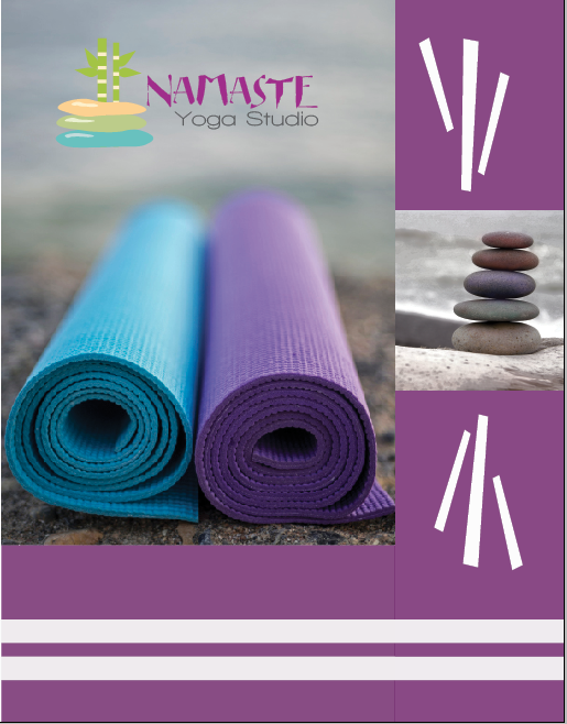
Description: This assignment was to make a brochure showcasing a logo, along with information about that logo, and an original design. I went with the Namaste theme again.
Process: I used three different Adobe programs including: Illustrator to create my logo in, Photoshop to edit photos in, and InDesign to do the actual brochure in. I had a hard time with the color scheme and getting it to work. This was actually a pretty hard project for me. Getting all the elements to come together and be cohesive was something I was only able to accomplish with the help of an expert opinion. I had some good basic ideas in the beginning, but getting them to come together was a little bit of a challenge.
Message: My message was one of calmness and serenity, and possibly even a good workout, that could be found at the Namaste Yoga Studio.
Audience: My audience was mainly young women looking for a break from their busy lives, but hoped to at least catch the attention of a few men that might be interested.
Top Thing Learned: I learned that having a consistent color scheme throughout my brochure proved to be harder than I thought, because I couldn’t choose too many images that had opposing colors in them that took away from my color scheme. The selection of images proved to be harder than anticipated.
Color Scheme and Color Names: I went with a big split complementary color scheme including the colors: violet, lime, teal, and gold.
Title Font Name & Category: My title font name was Eastern Brush and I believe it falls in the decorative category, but perhaps a hybrid of decorative and script would be more accurate.
Copy Font Name & Category: My copy font name was Walkway which is a sans serif font.
Word Count of Copy: I have a total of 418 words in my brochure.
Sources (Links to Images on Original Websites):
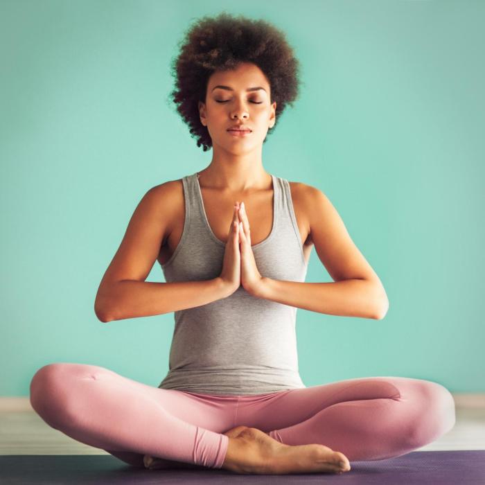
Woman posing- http://www.caroline .com
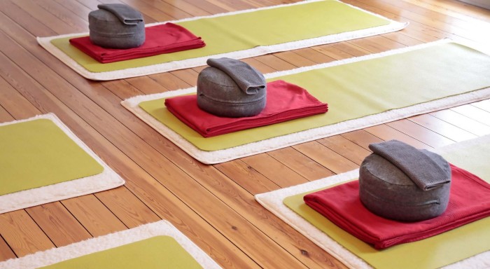
Mats- http://www.whistleryogacara.com/yoga-classes-schedule/
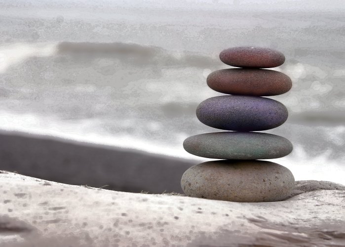
Rocks- http://kbshannon.com/banner/
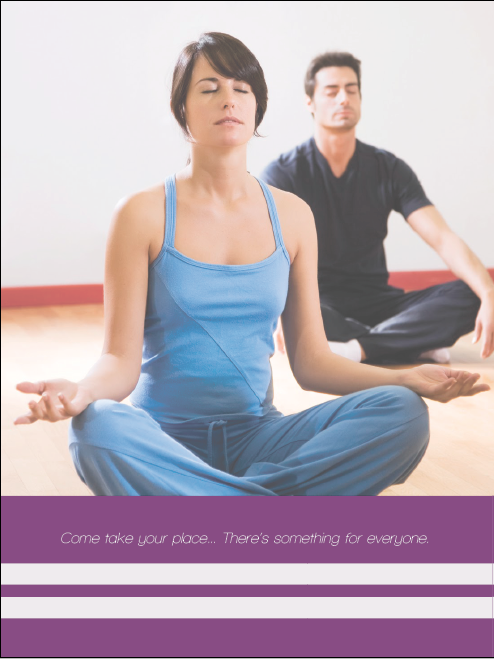
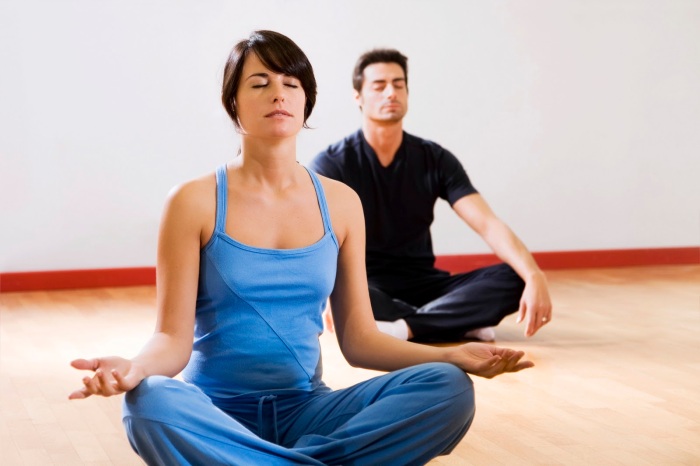
Man and woman- http://desktop.fansshare.com/gallery/photos/14810228/yoga-man-and-woman-man/?displaying
Yoga studio- http://seekretreat.com/top-10-yoga-studios-around-the-world/#.VmNMJ_mrTIV
Video Presentation:
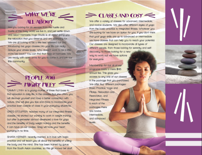
I would say the color scheme is my favorite aspect to your brochure, it flows together very well and the repetitiveness helps to draw the client in. I also like the use of the background image behind the text, it flows together well. Your font and logo really show a continuous theme of relaxation, which helps keep the theme consistent. This is an overall very professional brochure and looks like it could be used for a real business. Great Job!
Here is a link to my own project: https://rexburgunlimited.wordpress.com/2015/12/05/p8-brochure-project/
As well as another students design that I liked: https://brooksmcfadden.wordpress.com/design-3/project-8-brochure/
LikeLike
Great job on your brochure! I love the color scheme, it is very peaceful and fits well with your theme. You logo is super creative too. I like your use of lines throughout, they create nice repetition.
For another example of this project, check out:
https://camillacookblog.wordpress.com/2015/12/06/project-8-brochure/
LikeLike
Amelia! I love your project! It really grabbed my eye. I think the colors work really well with the design. The clipped image looks really good. I like the contrasting fonts. Everything works really well, and ties together. Great job!!!
Check out Tyler’s project! https://tylerjonathanwilliams.wordpress.com/2015/12/06/project-8-brochure/comment-page-1/#comment-13
LikeLike
Hey I looooooved your brochure!! I love the color scheme you chose. You even had a design that felt calming. The images you chose were beautiful! The text wrap was very precise. The image you cut out honestly looks perfect. I love the logo too! Fantastic job! Check out my brochure https://kimmymichaelis.wordpress.com/2015/12/06/100/
LikeLike